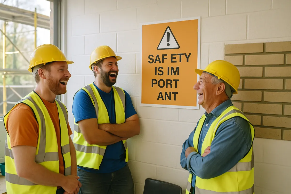
For masonry professionals and serious DIYers, that article should hit a little too close to home. Because in our world, “spacing” isn’t just about visual embarrassment—it’s about structural performance, water management, and long-term durability. The same precision that keeps typography from becoming a meme is what keeps brickwork from cracking, bowing, or leaking.
Below are five expert, field-tested practices for spacing, layout, and detailing in masonry that can help you avoid your own version of a “cursed comment” going viral—only in your case, it would be a failed wall on a jobsite instead of a bad sign on social media.
Get Joints Right: The Millimeters That Decide Whether Walls Last
The Bored Panda design examples show how bad spacing makes text hard to read; in masonry, bad joint sizing makes walls hard to trust. Mortar joint thickness isn’t just cosmetic—it's structural and functional. Standard brickwork typically targets 3/8" (10 mm) joints. Thicker joints shrink and crack more; thinner joints are harder to fully fill, leading to voids and weak bonding.
Start with a layout plan that aligns your unit dimensions (brick, block, stone) with your joint thickness so courses land at sensible heights and openings don’t require “sliver” cuts. Use story poles or layout rods for repeatable course heights, especially on long runs. During installation, use a jointing tool and gauge lines to maintain consistency across the elevation. On reinforced CMU, ensure head and bed joints are fully buttered and filled—voids around rebar can drastically reduce bond and load capacity. Finally, select joint profiles based on exposure: tooled concave or V-joints for exterior, weather-prone surfaces; raked or struck joints only in protected or intentionally textured applications.
Respect Movement: Stop Treating Walls Like Static Objects
In typography, kerning allows letters to “move” closer or further to read properly; in masonry, movement joints allow walls to expand, contract, and shift without cracking. Ignoring expansion and control joints is the structural equivalent of those viral pictures where someone squeezed text into too little space—only the outcome is shear cracks instead of internet jokes.
For clay brick, incorporate expansion joints at regular intervals (often 20–25 feet horizontally, depending on exposure and detailing) and at changes in height, thickness, or direction. For concrete masonry, use control joints to manage crack locations; joints should typically align with openings and corners, and spacing should respect code and manufacturer guidance (a common rule-of-thumb is wall length not exceeding 1.5–2 times the height between joints, but always check current standards). Make sure joints are continuous through the veneer or wall system and not “decorative” grooves that stop behind a corner. Use quality backer rod and sealant compatible with both masonry and joint width. In high-movement zones (sun-exposed façades, long corridors, parapets), plan joints before you start laying a single unit—retrofitting them after cracks appear is expensive and rarely fully effective.
Drainage and Weeps: Hidden Spacing That Decides Whether Walls Stay Dry
Those internet-favorite design fails show how tight or awkward spacing can block legibility; in masonry, poor spacing around flashings and weep locations blocks drainage—and trapped water destroys walls. Cavity walls, veneers, and even some solid masonry assemblies rely on strategic voids and weep spacing to manage moisture.
At the base of cavity walls, over lintels, and at shelf angles, provide through-wall flashings with exposed drip edges. Above the flashing, install weeps at a regular spacing—often 24" on center or per local code. Avoid making weep openings so small they clog with mortar droppings or insects; consider vents or high-quality plastic weep inserts instead of relying on open head joints that can be easily bridged with mortar. Maintain a clean cavity: use mortar nets above flashings and regularly clear droppings to preserve the air gap. At grade, don’t bury base courses where weeps are installed; they must remain open to daylight and air. Think of weep and cavity spacing the way you’d think of line spacing in typography—too tight or blocked, and everything starts to blur under moisture load.
Layout Around Openings: Avoid “Awkward Gaps” in Brick and Block
The Bored Panda spacing examples highlight how text forced into a bad layout looks amateurish. Masonry around windows, doors, and corners can look just as unprofessional—and perform poorly—if unit spacing and cuts are treated as an afterthought. Slivers of brick, misaligned soldier courses, and inconsistent reveals all scream “rushed work” to any trained eye.
Before you start, establish control dimensions from primary openings and corners. Dry-lay a few courses or run a software layout to understand where cut units will fall. Prioritize full or near-full units at corners and visible jambs; push cuts into less visible areas where feasible. On structural CMU, coordinate block module sizes with framing and structural design so you’re not carving up units around every opening. Above openings, align head joints in the veneer with support elements (lintels, shelf angles) and avoid odd, non-modular spacing that telegraphs structural improvisation. Consider accent courses (soldier, rowlock, or stacked bond) intentionally—don’t let them be accidental results of misaligned spacing around a window.
Tooling, Finishes, and Tolerances: The Last 5% That Everyone Notices
Most of the viral design fails aren’t about the core idea—they’re about the finishing details. Masonry is the same: the work could be structurally sound, but sloppy joint tooling, inconsistent reveals, and wandering lines are what make or break your reputation when photos hit social media or client group chats.
Establish clear tolerances before work begins—plumb, level, and alignment requirements based on applicable standards (such as TMS 602 in the U.S. or your local masonry spec). Train crews to check bond lines and joint widths visually and with simple gauges every few courses, not just at the end of the day. Tool joints at the right time: too early and you smear the face; too late and the mortar tears and loses weather resistance. On veneers, keep horizontal joints as continuous as possible; abrupt vertical shifts catch the eye, especially under raking light. Clean as you go, using methods appropriate to the masonry unit (clay brick, architectural CMU, natural stone, manufactured stone each have different cleaning tolerances). The goal is a façade where nothing “jumps out” as crooked or cramped—much like well-set type that you read effortlessly without noticing the spacing at all.
Conclusion
The internet’s fascination with bad spacing—like the viral design screenshots in Bored Panda’s latest roundup—is more than just entertainment; it’s a reminder that detail and proportion matter in every craft, from graphic design to brickwork. In masonry, those details control not just aesthetics but movement, moisture, durability, and, ultimately, client satisfaction.
By treating joints, movement, drainage, layout, and detailing with the same precision a typographer gives to kerning, you reduce callbacks, extend service life, and deliver projects that stand up both to the elements and to the inevitable photos people will share online. In a world where one badly spaced sign can become a meme overnight, well-executed masonry is a quiet, enduring counterpoint—nothing viral, nothing “cursed,” just work that looks right, performs right, and lasts.